Uber App Redesign Case Study
March to June 2020
Team Members: Leanne Chin, Chelsea James, Anna Leong, Wynn O’Donnell, Jason Wong
The goal of this project was to revamp the Uber app, focusing on three major goals: Ease of Use, User Control, and Safety. We determined these goals based on Uber’s company values and the needs of users that we interviewed and kept involved in many rounds of usability testing with our prototypes. To address these areas of concern, we designed new features including: an updated organization to make the ride ordering process more quick and understandable, the ability to customize any ride to ensure the most comfort for the rider, improvement to the Fare Splitting process, improved Rider to Driver communication, and more comprehensive safety features to ensure a smooth pickup experience. In the end, users were extremely happy with the features we implemented and felt like they would love to see Uber actually implement them, as they would make their ride experience easier, safer, and more enjoyable.
We were given the challenge to redesign an app of our choosing in a total of 9 weeks. We chose to redesign the Uber app, which is a ride-share app that enables you to book a ride whenever you need one. This all in one app holds the power to book rides quickly, maximizing your time to enjoy the quality of life. Uber allows you the ease of mind knowing you can get to where you need to be, wherever you may be by connecting yourself with others through just a few taps. The purpose of this project was to come together as a team and learn about the Uber business, research on their branding, and come together as a group to revamp the app both through branding and prototyping. Together, we came together to complete all of the tasks through collective data research, but also came up with our own individual ideas on what we envisioned for the future of Uber.
While Uber is a great ride-sharing app, it lacks the ability to easily navigate certain features that already exist, such as Splitting a Fare, as well as the ability to make a ride as customized as possible, resulting in a lacking overall experience. Many users also felt unsafe when using an Uber, especially due to stories in the news about unsafe situations coming from Uber rides. We have created this redesign to enhance the current app and ride experiences of Uber.
When redesigning the Uber app, we had a few main goals that aligned with the Uber company’s goals as well as the feedback we got during initial user surveys and interviews:
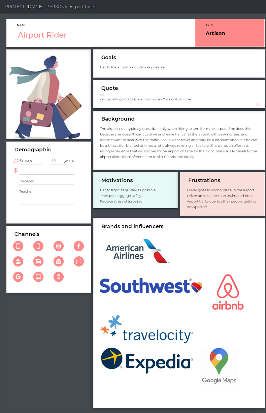
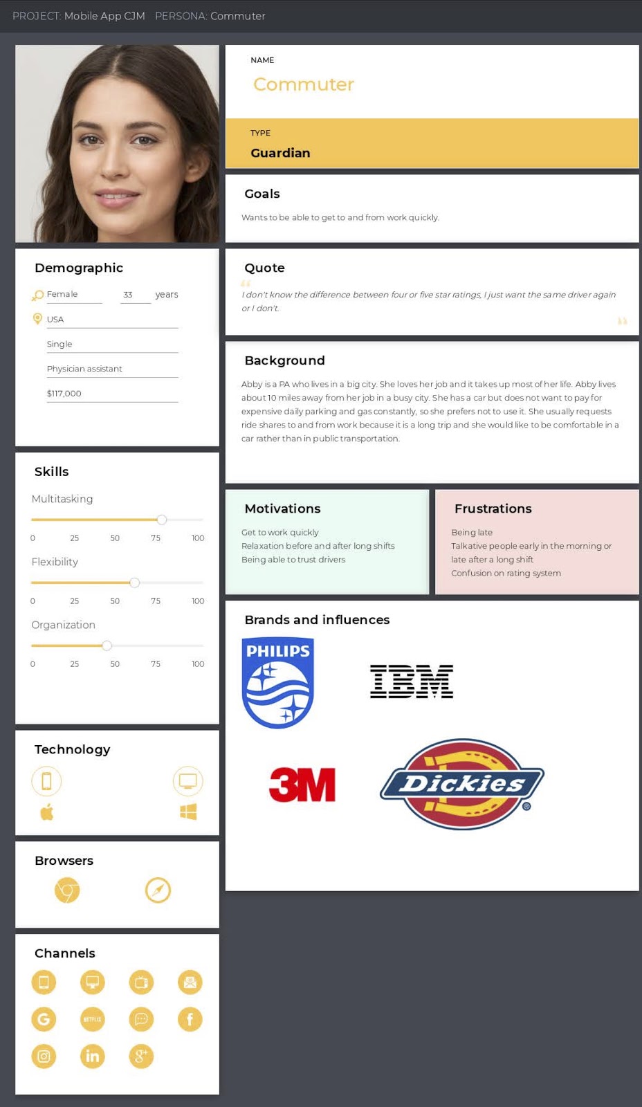
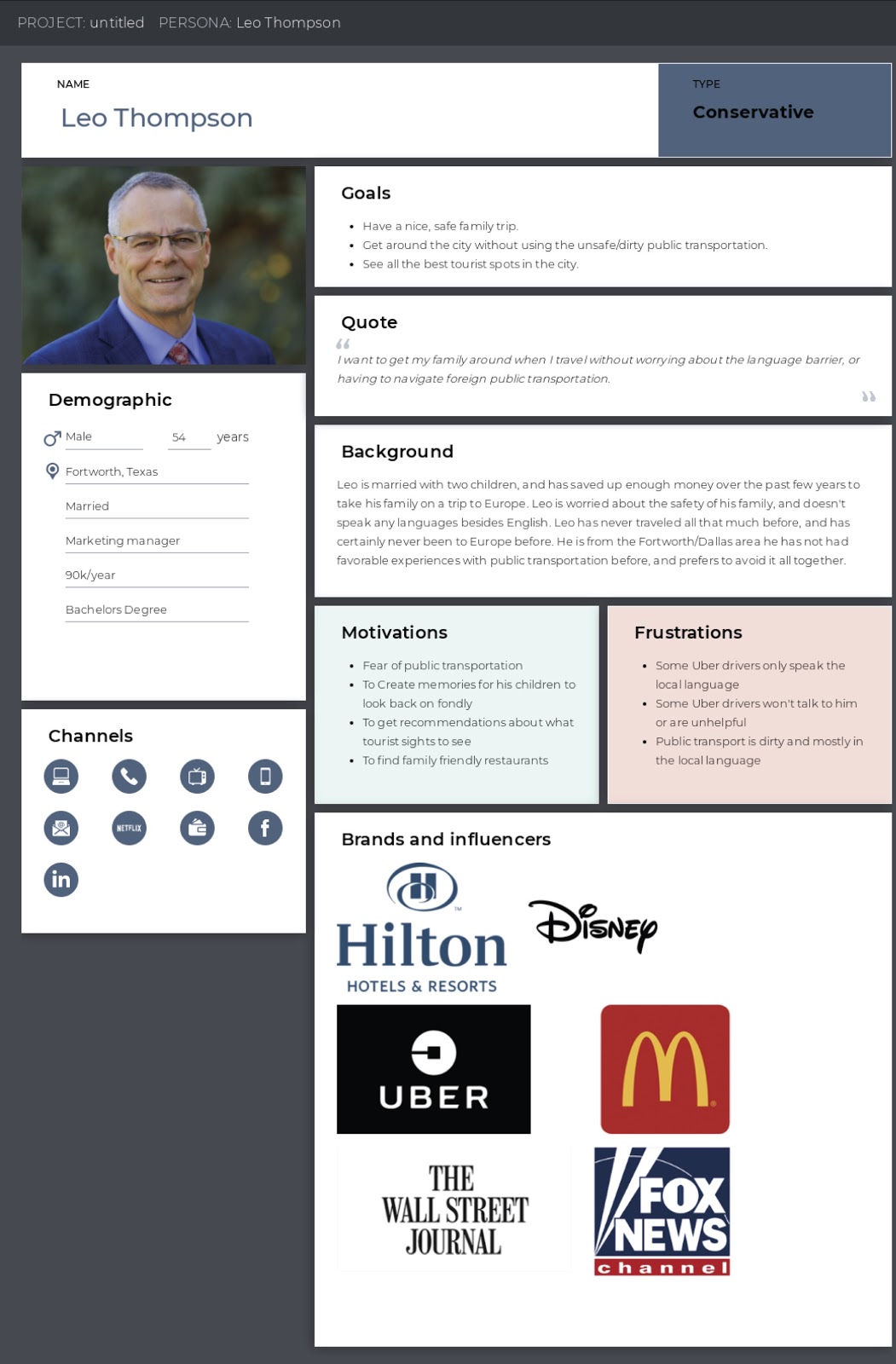
Target Audience / User Personas
As a team, we each took on a persona to help understand our audience better. Our personas included a young commuter, an airport rider, a businessman, a college partier, and highschool student. By doing this we were able to learn what our audience wanted, and create a redesign that will cater to their needs.
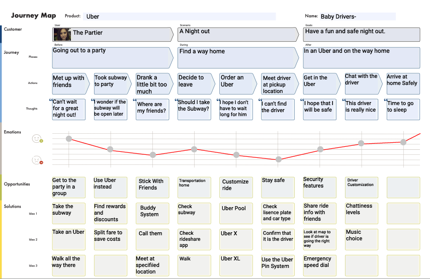
User Journeys
Based on the User Personas we created, we initially focused on one persona to get the ball rolling and created a user journey map. We made sure the app was easy to use for this persona and altered our design as we implemented more and more possible personas.
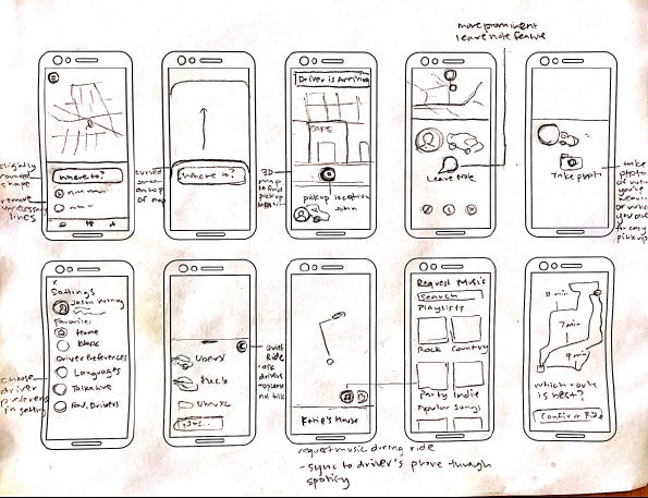
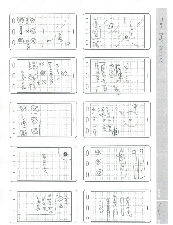
Design Sketches
Once our ideas were fleshed out, we decided to go ahead and sketch designs based on how we wanted to implement the new features into our redesign.


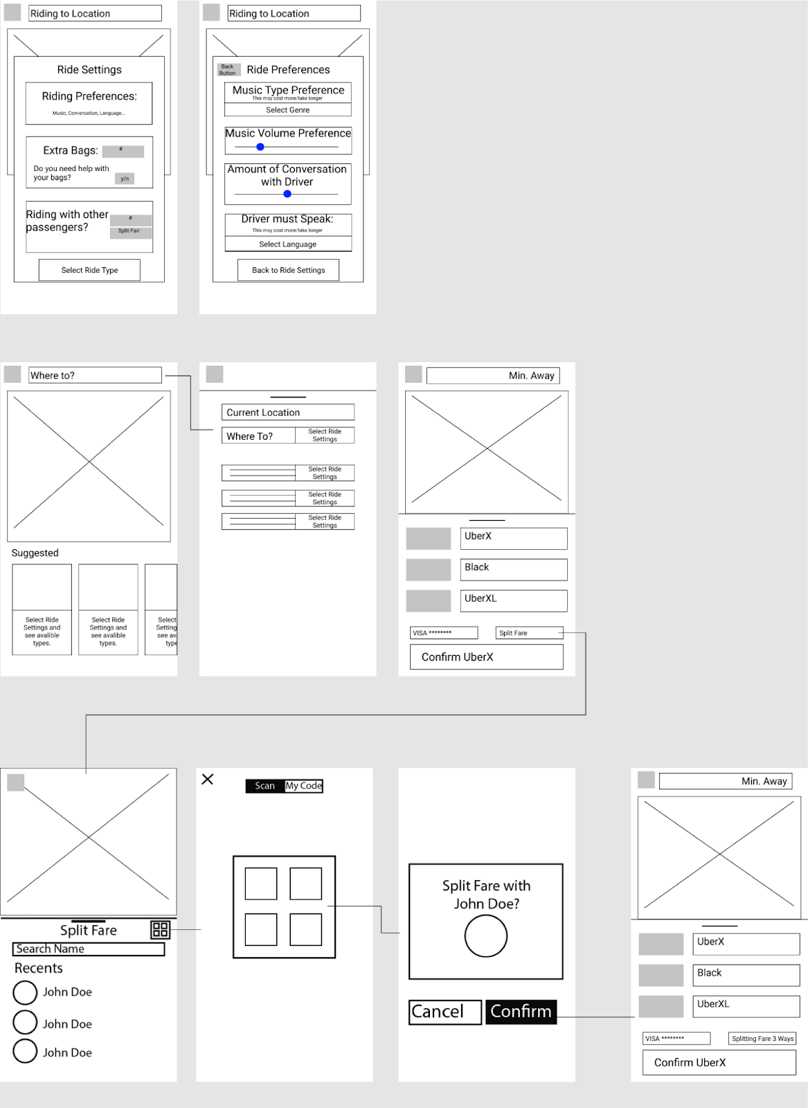
Wireframes
We looked at all of our sketches and decided how we wanted the redesign to look. We merged some ideas and completely got rid of others, resulting in our first set of wireframes.
Style Guide
After wireframing, we had an idea of how we wanted our new features to work. We knew we wanted to keep the simplicity and elegance of Uber but give it a friendlier feel to make people feel more comfortable using the app. The question was, how? We each created an individual moodboard full of illustrations, fonts, color palettes, and images that we thought of when it came to Uber. We took the best pieces from each individual moodboard and combined them, creating one moodboard that housed all of our ideas that we believed would work well for our redesign.

Prototypes
Moving from wireframe to prototyping was fairly easy for us as a group. We had wireframes and we had a moodboard, all we had to do was combine the two. After fixing the look of our redesign, we had to take into consideration the task flow of the already existing Uber interface and the task flow of our new redesign that we wanted to implement.
Low-Fidelity

Our initial prototype has gone through numerous changes and updates based on task flows and user feedback.
Mid-Fidelity
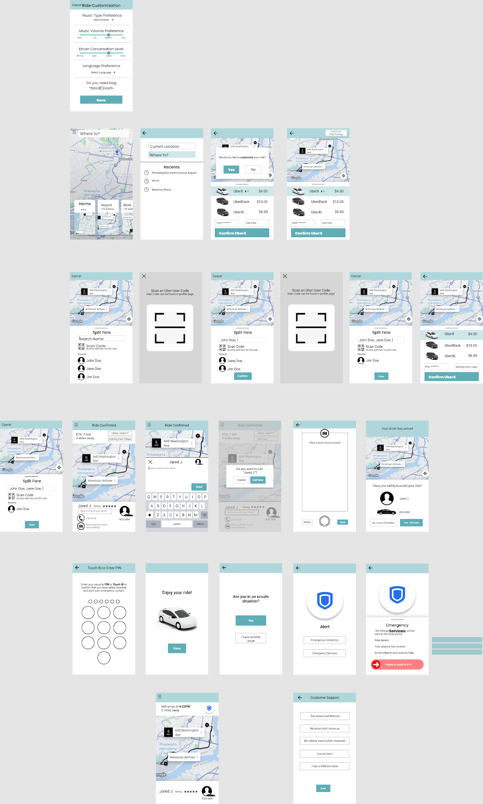
High-Fidelity
UX Testing Notes
Presenting our prototype to users was where we got the most feedback and information to help us correct any errors that users found in the prototype. Although we were sure of how our prototype worked, users have a different point of view because it is new to them. We needed to make our prototype as easy as possible, leaving the users without questions as to how to use it.
Our redesign adds a whole new level of customization, safety, and style to the Uber experience while still keeping the same feel and features of the basic ride experience that Uber users have come to depend on. We gathered useful information during user interviews and brainstormed ways to improve the current experience.
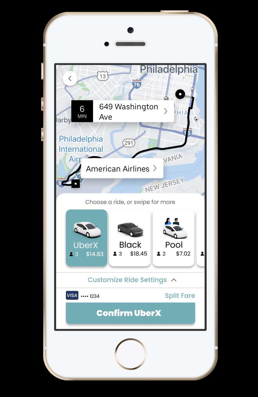
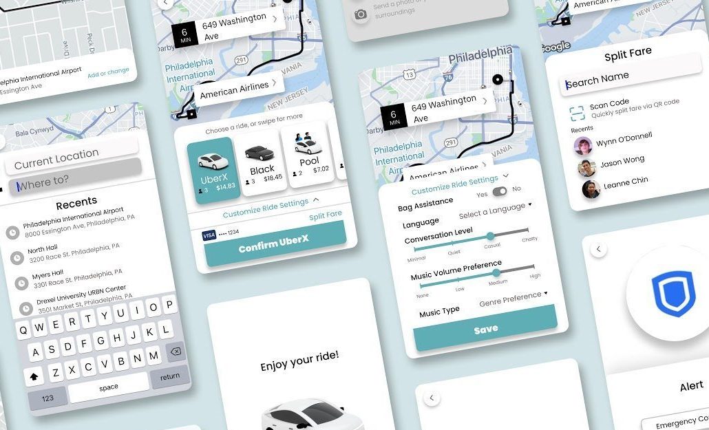
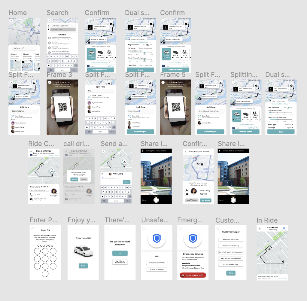
First, we created a card-like interface on the home screen that displays past or frequent trips. This makes it quick and easy for commuters or frequent riders to choose the trips they need. We also carried this card-like interface over to the Ride Selection screen to make it easy to understand and navigate through the different ride options.
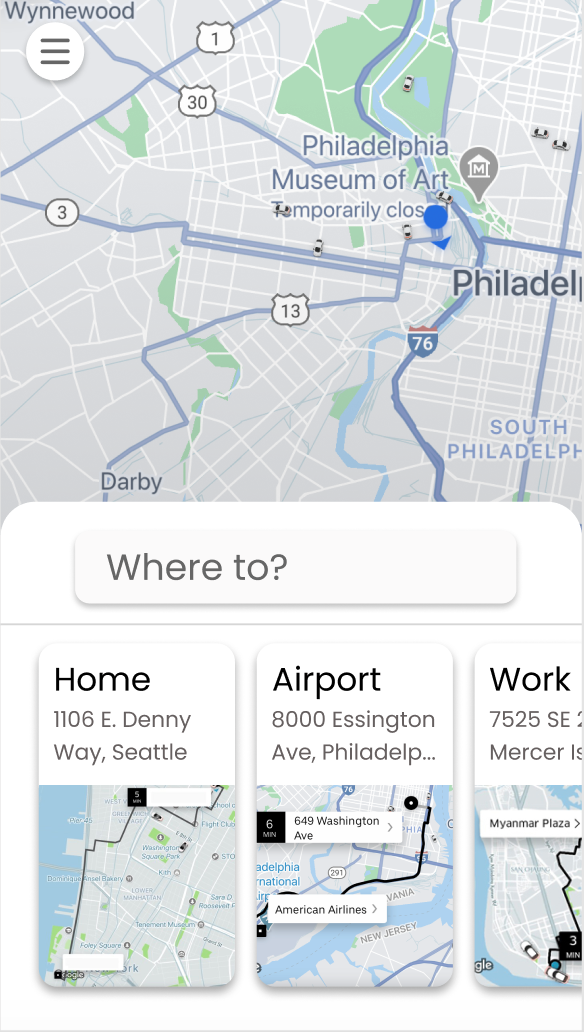

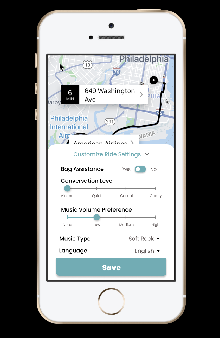
A big change we made was the ability to customize their ride before actually requesting the ride. The process of customizing a ride would be very new to ride-share app users, so we made it as simple as possible to navigate. We included titles along with sliders and buttons to minimize the amount of text displayed on the screen, allowing users to easily input their preferences or change their preferences when needed.

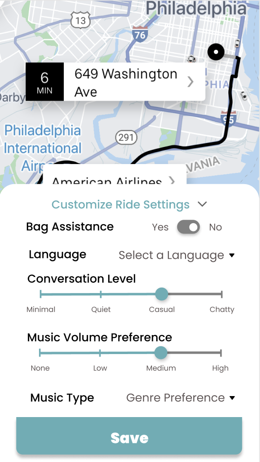
We also wanted to improve the Ease of Use of the Split Fare feature, something that sets Uber apart from its competitors. We made it easier to find and available even before you book your ride. We added a QR code feature where users can quickly split fares with their friends in seconds by scanning their personalized QR code. This feature is noticeable by the QR code icon, housed on the Split Fare screen. To make new features more recognizable, we added icons that users can relate to.

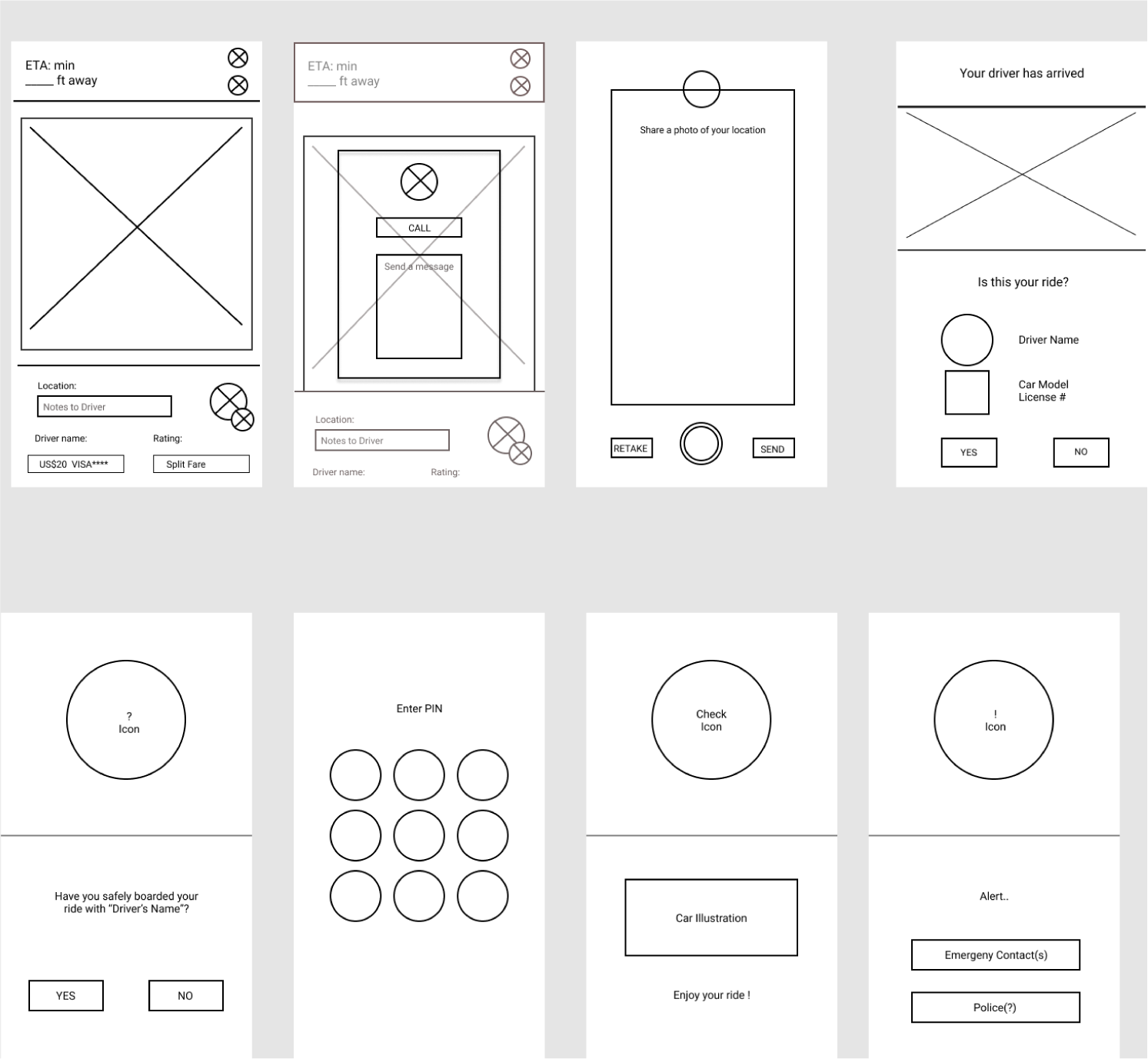
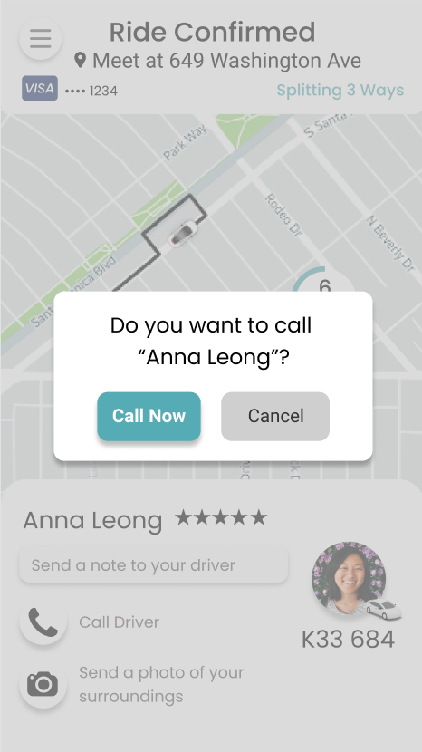
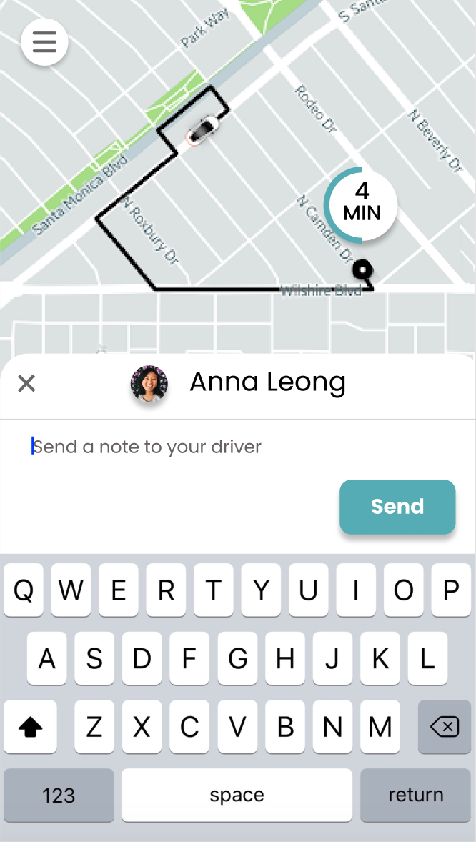
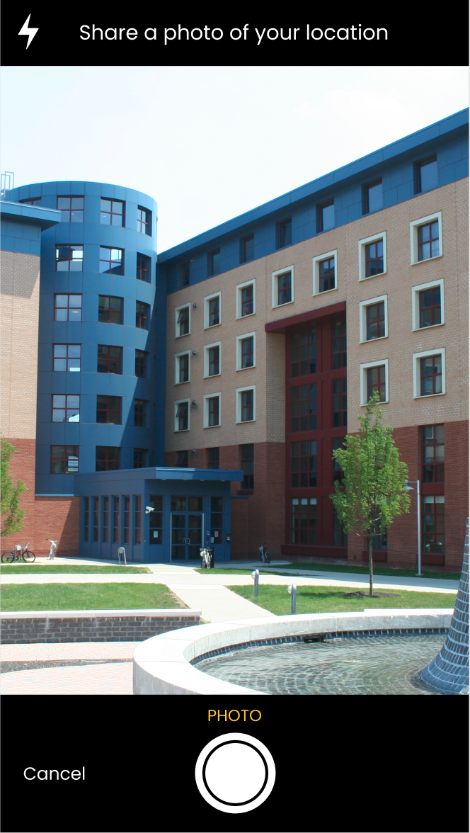
In addition, we wanted to streamline the process of finding and meeting up with the driver, which several users had problems with. We made an easily understandable “Driver” panel that the rider will see after the ride is confirmed. The rider can easily call and message the driver. We also implemented a new feature to remove any confusion over where the meetup location is and looks like, where users can send a picture of their surroundings to their driver.

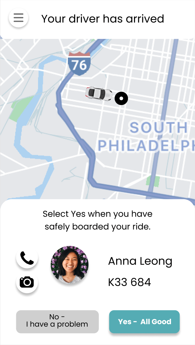
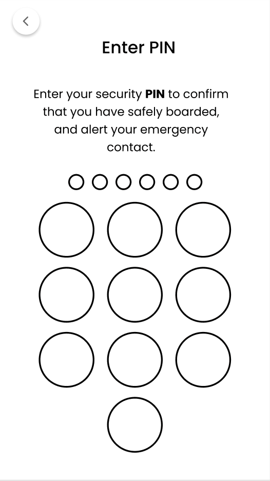
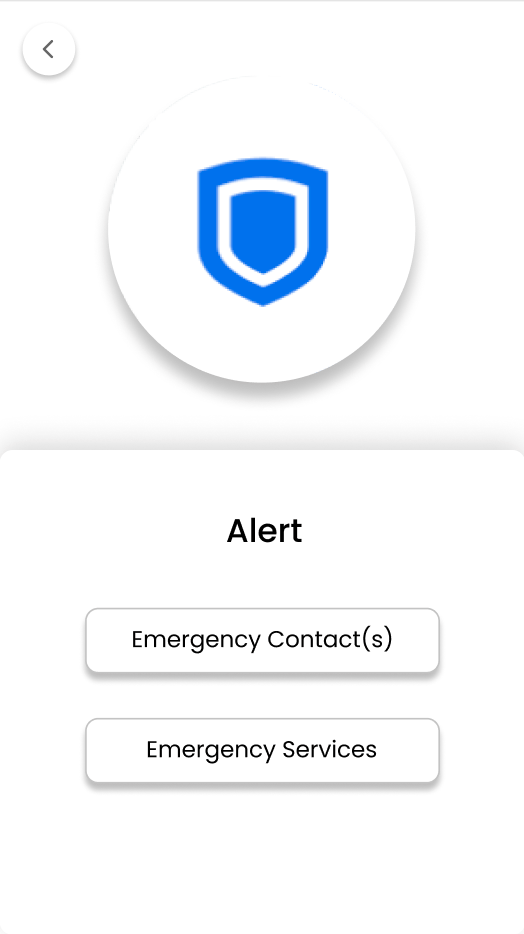
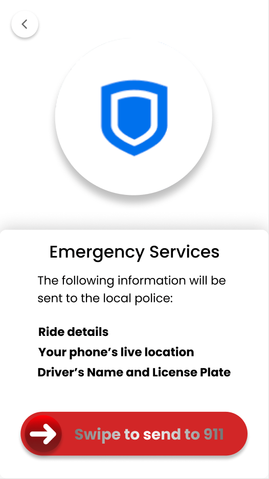
We added many safety features to ensure the pickup process and the rest of the ride goes smoothly and safely. These new safety features can be opted-in by the user. First, the rider has to confirm that they have been safely picked up by the driver. They must input a personal safety PIN to confirm this before the ride begins. If the driver has falsely indicated that a pickup has occurred, or the rider feels like they are in an unsafe situation after they have entered the car, the rider can easily indicate this and either contact customer service or send an emergency help notification to their Emergency Contacts or Emergency Services.
A successful pickup

A problem occurring during pickup

Visual Design and Branding
Finally, the overall feel of the original Uber app was a bit unwelcoming, so we decided to add an accent color to compliment the black and white original color scheme, making the app feel more friendly to users. However, we made sure not to go too far to move away from Uber’s current chic brand and veer into Lyft’s more colorful and neon brand image. We added a bit of roundness to the interface and buttons to enhance that friendly feeling, and got rid of some of the unnecessary dividing lines around the app to make the screens simpler and more modern looking.
Colors used in our interface

Our team redesign of the Uber app was a success. As we first interviewed users, we received loads of different info that we used to brainstorm our ideas, landing the team to implement the customizable features of the app as well as making the app feel more welcoming and friendly. While conducting interviews we gradually got to a point where users were more comfortable using our prototype, where we could not think of ways to improve without leading to scope creep or complicating the design and user flow. As a team we all learned that we cannot “marry” one set of ideas; these ideas can constantly change.
Here are some quotes we compiled from our users:
“I would prefer this version if Uber updated it to this.”
“I can feel safe because the app is watching out for where I am.”
“I like these security features a lot. It made me feel like Uber actually wanted to ensure I’m good.”
“The font is nice and easy to read, and the icons work well and are easily understandable. It’s easy to find the important information.”
“I absolutely love [these new customize ride features]. Depending on my mood, I would wanna choose whether I want to talk to the driver, and the music.”
“I really like how you have the split fare option right away. It was confusing before how I had to pick the ride and then split the fare later.”
“I think if uber actually had these features, it would make it a lot easier.”