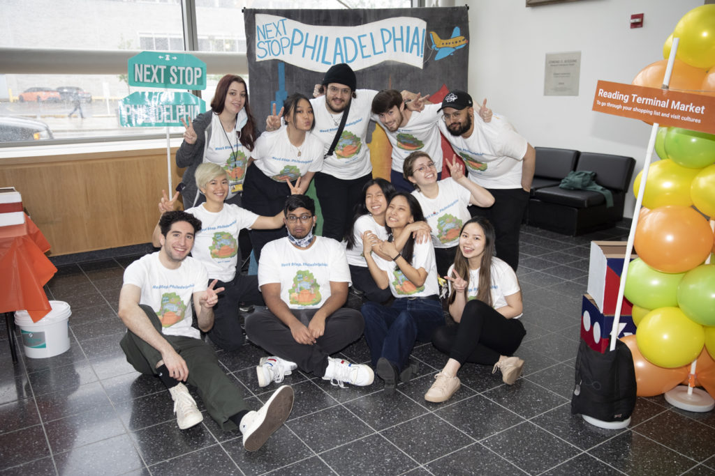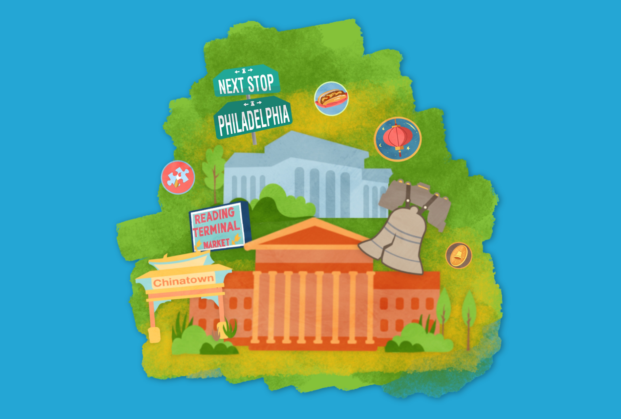
Next Stop Philadelphia
August 2021 to June 2022
Next Stop, Philadelphia is a digital and hands-on interactive exhibition geared towards children ages 6 to 11 in order to get them engaged with their city. The city of Philadelphia has so many great attractions and historical sites to see, but younger children, unfortunately, cannot visit these sites without having to go with their parents, where typically older children are able to view all of Philadelphia in one day by themselves.
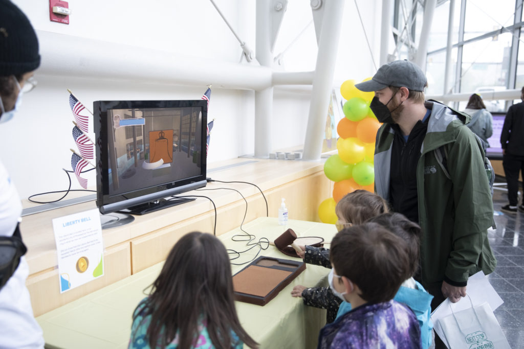
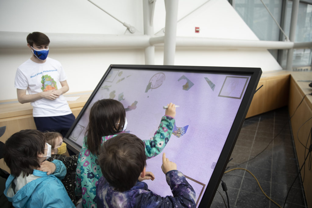
To provide younger children the experience of interacting with different parts of their city, and even children visiting from other cities, Next Stop, Philadelphia was designed to bring audiences a new way to travel through Philadelphia while teaching them about the city in a fun and educational manner. This will be done by creating 5 different “stations” that children can visit: Old City’s Liberty Bell, Reading Terminal Market, Chinatown, Center City, Philadelphia Museum of Art, and 30th Street Station.
I was the Story Lead for Next Stop, Philadelphia, and secondary Research and Product lead for the product. Being the Story Lead for the exhibition means that I develop the storyline that helps guide the visitors throughout the exhibit. This includes creating an engaging storyline with characters and their illustrations that will be present throughout the exhibit. This is done through research on reading styles tailored to elementary school ages and how to create a writing style that can best suit such a wide range of ages.
The responsibilities additionally include a dialogue script of what characters will be saying before the exhibition starts, during the exhibition, and when it ends as well as developing a storyboard for each “station” and how instructions will be presented for each activity to the children.
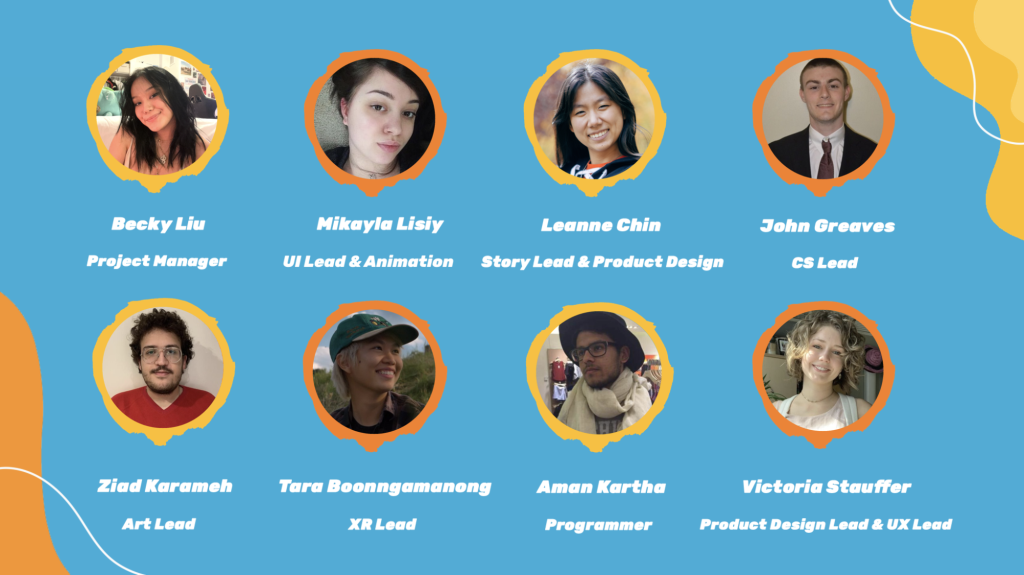
There are no scopes or constraints to the project, as long as we are developing anything the relates to the realm of Digital Media. However, because the project consists of User Experience & Interaction Design (UXID), Game Design & Production (GMAP), and Computer Science (CS) students, the project must include aspects of game design, and development. The UXID students are focusing on the Storyline, User Interface of the digital components, UX Research, and Physical Production of Exhibition space. The GMAP students will be working on the digital game designs and building the assets needed for each game that is developed. The CS students will be working on testing different sensors, programs, and developing our ideas into physical games that can me played throughout the exhibit.
The first step when starting out this project was finding research on how to develop an exhibit specifically for children. The first thing I did was go to the best source possible on how Philadelphia is being presented to children: The Library. I found as many books as possible that were about Philadelphia that were specifically geared towards the ages of 6 to 11.
From here, I compiled all the books and read every one of them to find inspiration not only for how the story should be conceived and written, but also aspects that could be displayed in the exhibit that were used in each of the books.
I found that children’s stories tend to have simpler words, and many adjectives to help provide visuals to explanations that might be hard for some children to comprehend. Also, many of the books provided sequences of events that were easy to detect that they were being listed, such as the usage of words like “first, second, last.”
From here, we were able to see what landmarks in Philadelphia are most prominently taught in books for younger ages, but also seeing what landmarks are not being as well-represented as they should be. Places such as Old City, City Hall, and the PMA were viewed more than spots such as Reading Terminal Market and Chinatown, which are staples to Philadelphia.
The story has gone under several different revisions ever since the first concept. Initially, the idea for the exhibition was just to have different landmarks of Philadelphia where children were able to play random games associated to the station. There were stories associated to each “station,” but none of them had any cohesion or connection to one another. We, as a team, found out that by implementing this, there was no reason for children to go through an exhibition, and there was nothing guiding them through the experience. We had this assumption that the audience would know to go to each station without having a purpose.
Through much talking and research, we began to develop a more cohesive storyline that was able to better guide children through the exhibit using a narrative and incentives to go to each station. We also have our stations with games and elements that help guide the story along so that the children and feel the cohesiveness of the exhibit rather than have it randomized.
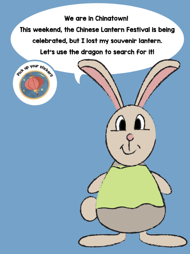
Through research interviews with elementary school teachers, the story team and UX team realized that in order to have an exhibition that ran in a narrative sense, there had to be something driving the story throughout the exhibition, something such as an incentive that is used as something that teaches the children throughout the exhibit while also helping to guide the story along. The learning incentive that we developed were souvenirs that the children would have to help the characters “find” before leaving Philadelphia. We then mapped out what each station would incorporate and how to fit a specific souvenir to each station that it would make sense. This was all based on how we can create learning objectives, learning goals, and ways that will keep children engaged.
One of the biggest things when trying to develop our designs and our games for our exhibition is how we will could physically be able to guide children through the exhibit, and how to specifically design the digital aspects and physical components of the exhibition for younger audiences. To find more about this without directly working with kids, I visited a limited exhibition at The Franklin Institute called “Crayola IDEAWORKS.” Through this exhibition, there was much good research that was done to learn more about what it means to design for kids in terms of how high screens need to be, how the User Interface needs to be tailored, what types of media do kids gravitate towards, and how are instructions being presented to them that makes it easily understandable.
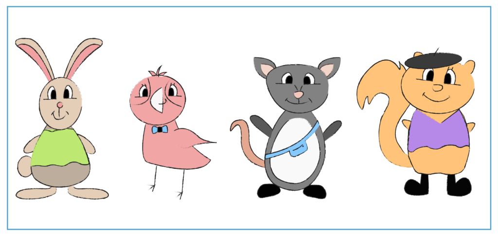
The first thing that I did was investigate some research about what type of characters are generally in kids’ shows. Are these characters humans, people, objects, etc.? Through research, I found that there is this concept called Anthropomorphism where anything that isn’t human is given human traits to provide some emotional disconnect to the audiences, while also being able to connect enough to provide them with lessons. These characters were able to bring easy understanding, interactive engagement, and a sense of inclusiveness.
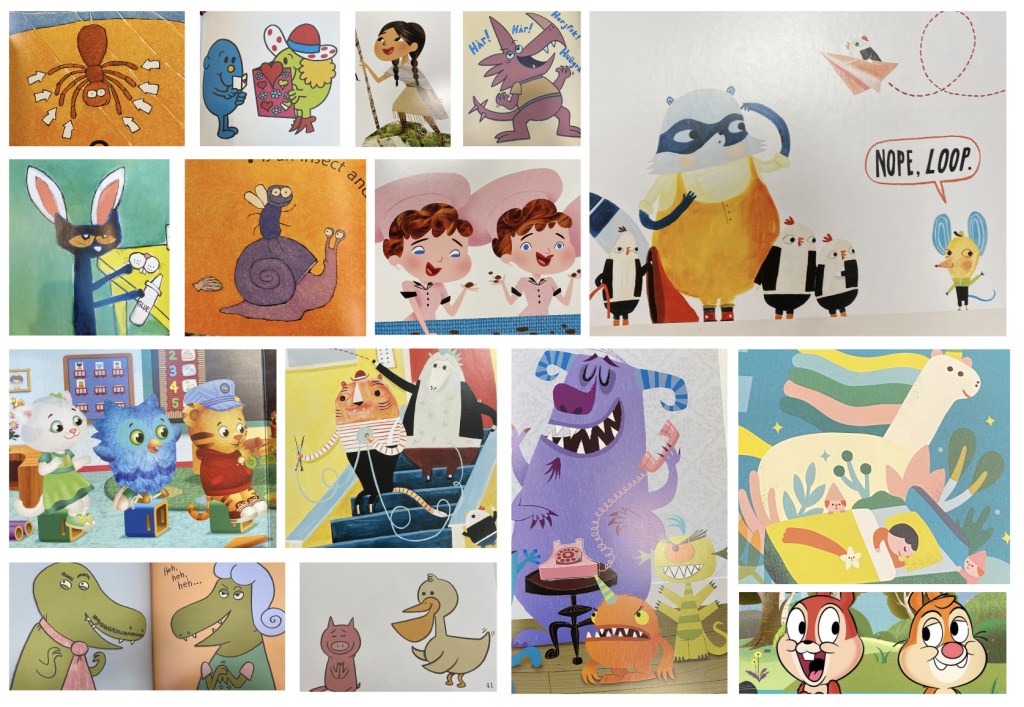
I then sought to find inspiration that would help guide the illustration of our characters, and the art style that they could follow. At first, I tried looking online, but it was difficult to find an art style that are typically seen in books that I was envisioning. I decided to do some research and look at the Drexel Hagerty Library’s children’s section. I then went to the bookstore where I looked in the little-kids section where there were picture books reflecting styles of today’s illustrations. There were many illustrations that were simple, but also filled the character’s colors in with photoshopped textures. I took pictures of all the ones that I found inspirational, creating a mood-board that showed all the different styles of 2D character illustration.
After going into research on what animals are native to the city of Philadelphia, those animals were drawn on the iPad using an application called Procreate to create sketch-like illustrations of our characters that featured connections to each of the stations
While working on the Storyline of the exhibit, I also worked hard in the Product Design side of the exhibit. I worked with our Product Design Lead to ensure that we had decorations accompanying the crafts and the games to make the exhibit a full immersive experience for visitors.
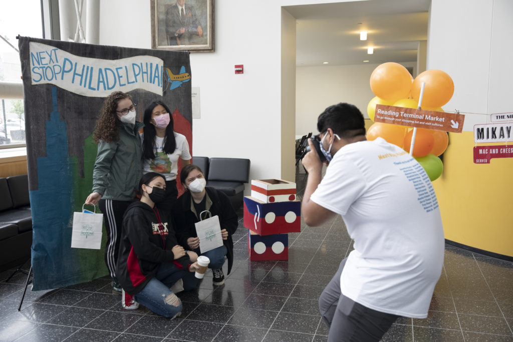
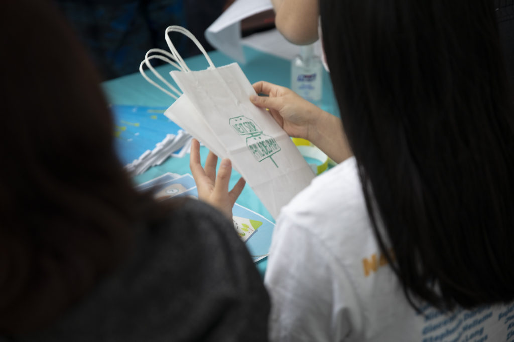
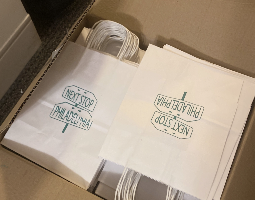
Entrance Bags
Because we have such a large variety of crafts, we wanted a way to allow visitors to consolidate all of the materials they collect throughout the exhibit. We used paper bags, but I thought that we should make our bags a part of the experience by screen-printing our logo onto the bags so that the bag itself could be a souvenir from the exhibit. I hand-screen-printed logo onto 100 bags to ensure the best possible quality and care.
Exhibition Signs
To let visitors know what each station was when coming into the exhibit the team agreed on creating signs that showed what each station as called, and also creating another set at the entrance that could show where each station was located. We also decided that in order to keep the feeling of Philadelphia, we wanted our signs to represent signs you would see on your daily commute. To do so, I created signs that directly reflected the signs from the Septa Subway system by using the fonts, arrows, and the rectangular shape. To keep it consistent with our theme, I made sure that each sign was a color used in our color palette.
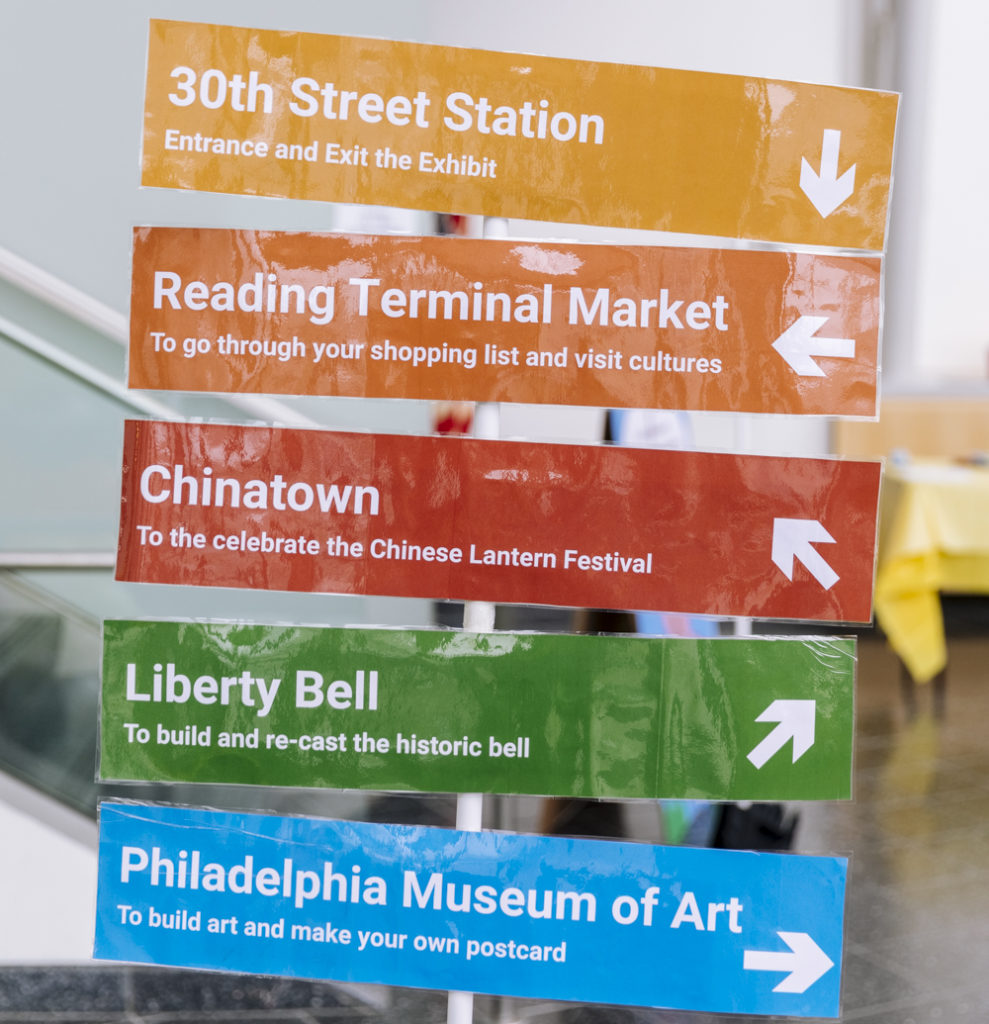
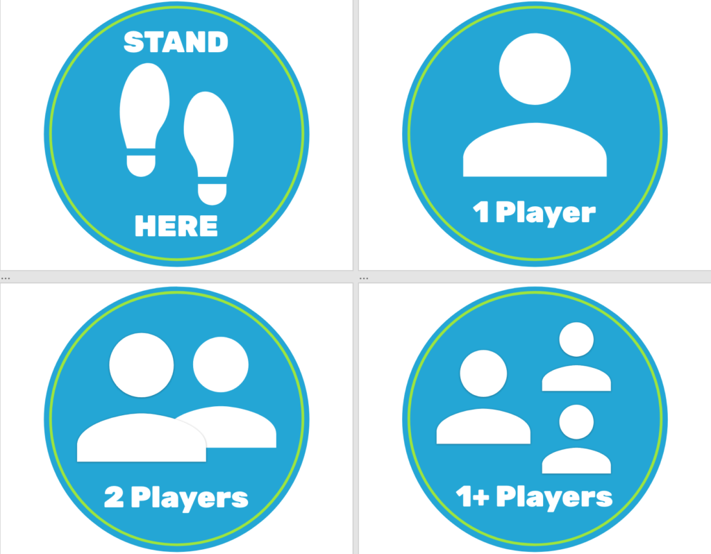
In order for attendees to be given some direction of the games without us having to directly communicate with them, we came up with the idea to create signs to show how many players per game can interact with the digital games, as well as making signs that will be taped to the floor to show where to stand for each game since some games have sensors that require the user to be a certain space close/far from the sensor. This allows an indicator for the attendees to know where they should stand to give them the best possible experience!
Creating Cardboard Wearable trains
On my visit to the Strong Museum of Play in Rochester back in March, there was something that caught my attention that was able to capture a child’s attention and make them feel even more included within the exhibit. What I saw were wearable cardboard trains/cars that kids were able to wear and walk around in. I wanted to bring this into our exhibit to give more of an environmental experience. Instead of just doing activities, you can feel as though you are actually apart of the environment of Philadelphia that we have created. The designs were inspired by Philadelphia’s Septa system, drawing the designs onto Procreate and then painting onto recycled cardboard boxes.
Character Implementation
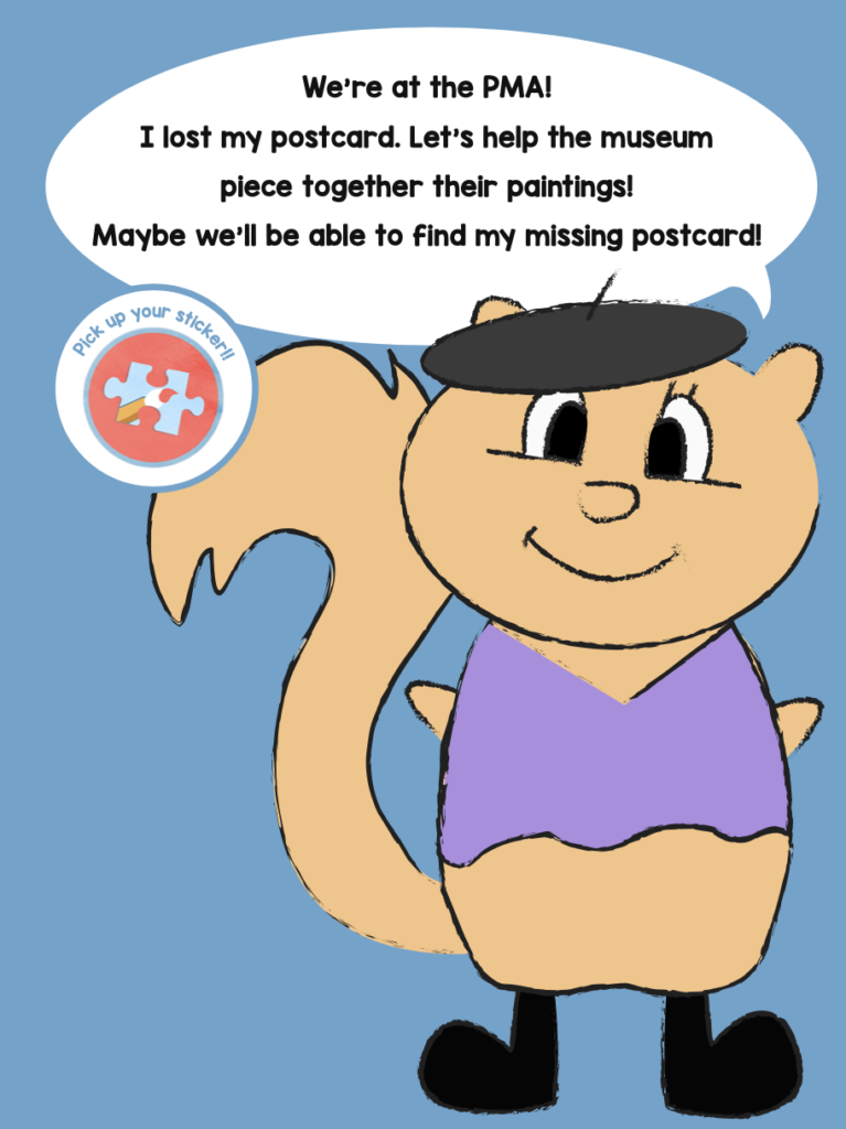
Initially, our team wanted to have videos of the characters at each station before playing the game to provide a short explanation to what the visitors had to help them find and where they were. We realized that after our game title screen, the tutorial, and game itself, adding a scene with the characters in front would make waiting to play the game unnecessarily long. Instead, I proposed that we create cutouts of our characters that we display in front of each station that provides a very short description about where they are and how to help the character find their missing souvenir. In the end, I used Adobe Illustrator to create 4ft tall printouts that utilized the character and a speech bubble, as well as the missing souvenir to provide a brief explanation. These printouts were mounted onto 8ft tall pieces of recycled cardboard that were built and folded in half.
Reading Terminal Market
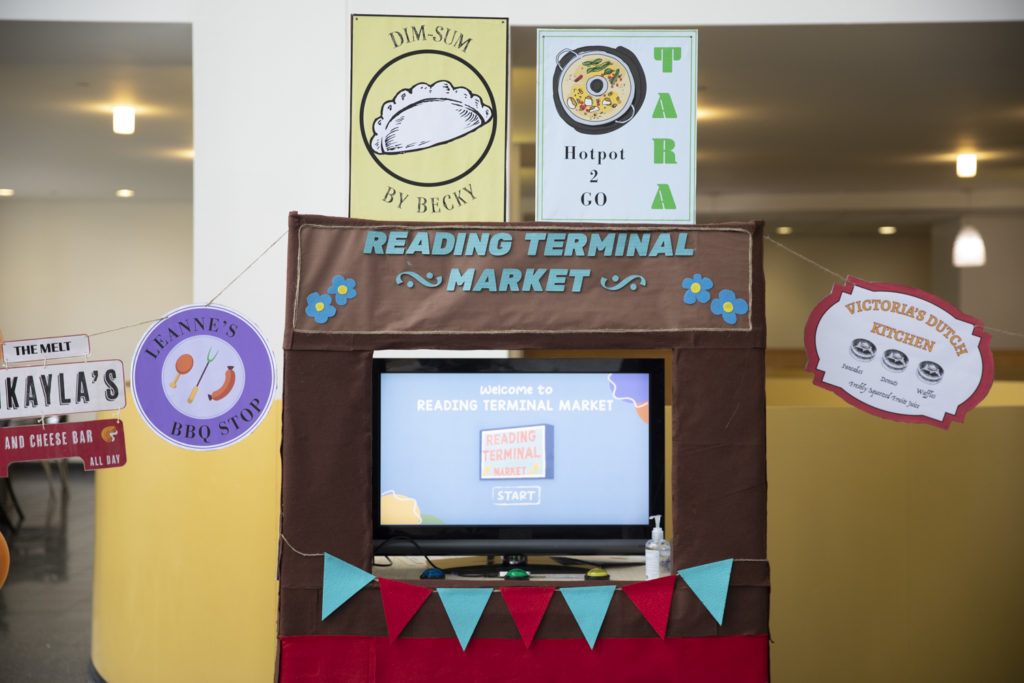
For the Reading Terminal Market Station, I wanted to create a space where it felt like you were in the market itself. I went to Reading Terminal Market in Philadelphia and walked around trying to understand what the feel of the environment was and took pictures of each of the kiosks and their signs. When it was time to design the signs, I used Adobe Illustrator and used each of our team member’s names as restaurant names as well as drawing inspiration from each of the real-life signs from the market, while tailoring each sign to our team’s favorite foods. The signs were then laminated and mounted onto cardboard backings, and later hung up in the Reading Terminal Market station during the exhibit.
Philadelphia Museum of Art
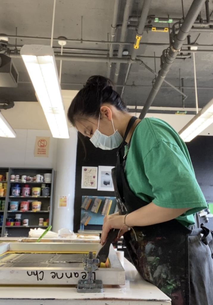
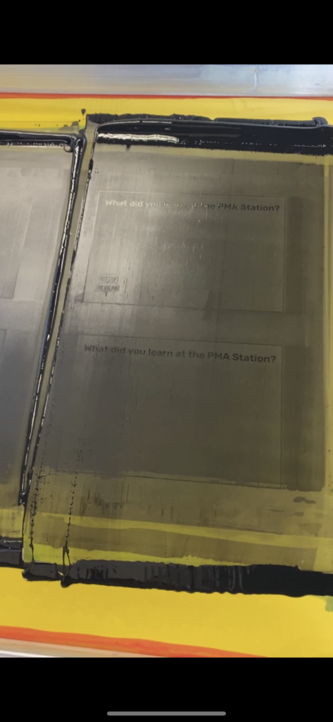
For our PMA Station, we had postcards that kids can decorate and hang up while also answering a question about the exhibit on the other side! To get the question and logo on one side, I knew that I would have to print it in some way onto the 100 postcards. For screen printing, I had to create an Illustrator file that had both the logo and the questions. The illustration was then put onto the screen and ready to be printed onto the postcards.

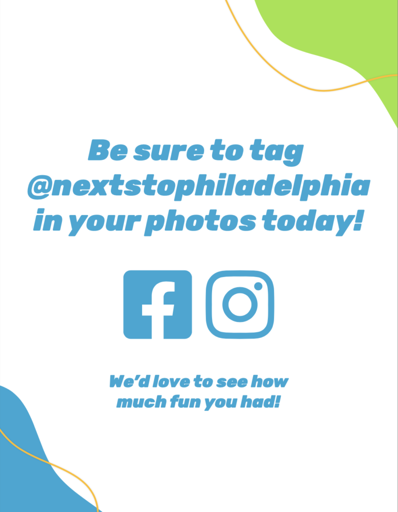
With my background in Social Media Marketing and marketing around Drexel University’s campus, I oversaw the Marketing of our project. First was putting our name onto Instagram and introducing ourselves. We made posts that showed who we were and what our roles were, those posts were designed by our project manager Becky.
Throughout our first week on Instagram, we were fundraising for our product, where I oversaw designing those posts. Showing our goal, what our project was, and showing how our goal was progressing throughout the weeks. The Instagram was eventually populated with what our stations were, our behind the scenes for product design, and our day-of exhibit.
I also made our Facebook page to ensure that we were reaching out to parents on Facebook. This was in collaboration with Victoria, to make sure that were targeting the right audiences. The two of us additionally sent flyers out that I designed in Adobe Xd to an elementary school in Philadelphia.
We wanted to make sure that this event was open to everyone, even though the targeted age range was for elementary school children. I printed around 150 posters to hang around Drexel University’s Campus to ensure that we were targeting our marketing at as many people as possible, while also contacting Drexel’s Campus Activities Board, Drexel’s Westphal College, and Drexel Campus engagement to advertise our one-day event. We were able to get several emails and reposts out about our event that allowed an increase in advertising and audience reach.
Through this first part of the exhibition process, I learned very early on that when designing things for young children that are interactive, not everything is made because it seems fun, or it seems enjoyable to do. The storylines that exhibitions develop, the characters, and the interactions that are created are all backed up by learning objectives to teach to the target audience and heavy research. I found it very interesting and very important that although it seems like an exhibition for children is exciting and fun, it is because of the research that goes behind every little aspect.
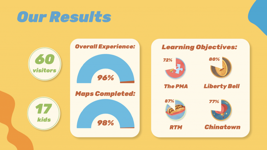
Overall, on May 7th 2022, we had an amazing turnout for Next Stop, Philadelphia. We had 60 visitors, with 98% working through the entire exhibit and completing their map. Our Learning Objectives were met with above-average scores, ranging from 72% to 87% and we had a visitor satisfaction rating of 4.8/5. We are pleased to say that we achieved our goal of immersing our visitors in the history and culture of our city at this fun-filled exhibit, Next Stop, Philadelphia!