Lenfest Institute for Journalism Website Redesign
March to September 2021
From March 2021 to September 2021, I was tasked to redesign the Primary and Subpages for The Lenfest Institute for Journalism. The website itself was great at providing information about the city of Philadelphia, as well as providing global news, but information regarding the Lenfest Institute itself had webpages that weren’t as easily usable and accessible.
The goal of those reading was to ensure that there was a better hierarchy system in place while going through the primary, and secondary pages for the website. First, every piece of information ran one after another. There were no clear breaks in different sections, and it was hard to tell what buttons related to which topics. Due to the lack of hierarchy, it was certain pages were difficult to navigate, and the goal was to rid of the complications to allow easiness or readability and usability of the website.
The hardest problem that I ran into when redeveloping the hierarchy of the information on the pages was to figure out a way to move from the continuous scroll of information. Each section was formatted in a way that required the user to scroll to find more information for a button, or it was difficult to figure out that a button related to a specific block of information on the page. The first thing I did was to keep the same format of a paragraph, and having a button follow it, but sectioning each block of text with a colored box, or a background image. It was clear that although this gave a sense of clearer organization, it was still difficult to scroll through, and made the user tired becuase of all the additional information.
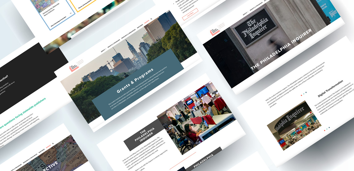
Next, I went back in a rethought of all the different ways that information could be organized where it was short and sweet, but also allowed the user to understand that the information on the page would lead you to a second page of information with just a glance. I worked on developing different grid systems to allow the user’s eyes to not have to read an entire section to understand what it might be about.
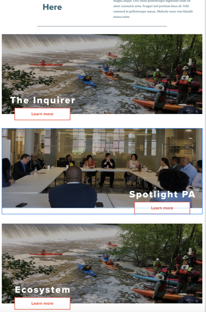
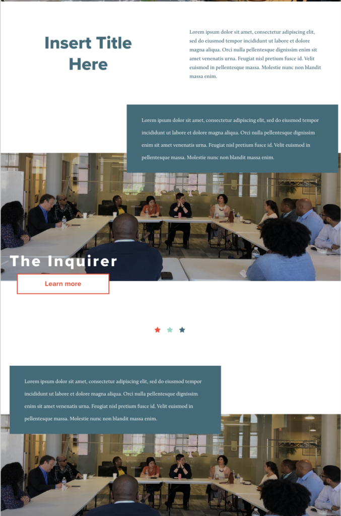
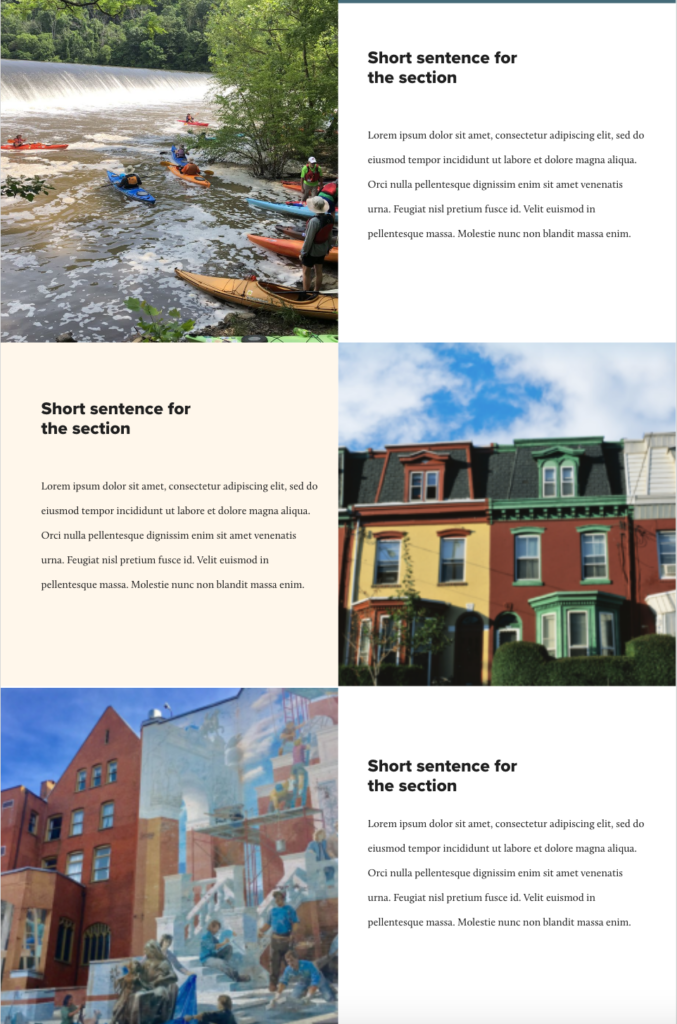
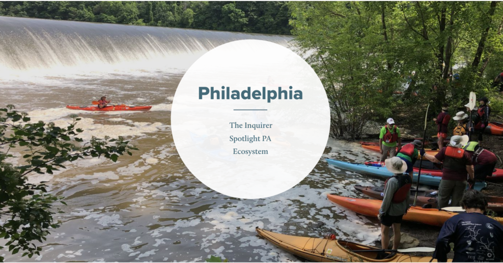
After discussion with the team at the Lenfest Institute we landed on using the grid system that combined an overlapping section title, and a short paragraph to the side of the image.
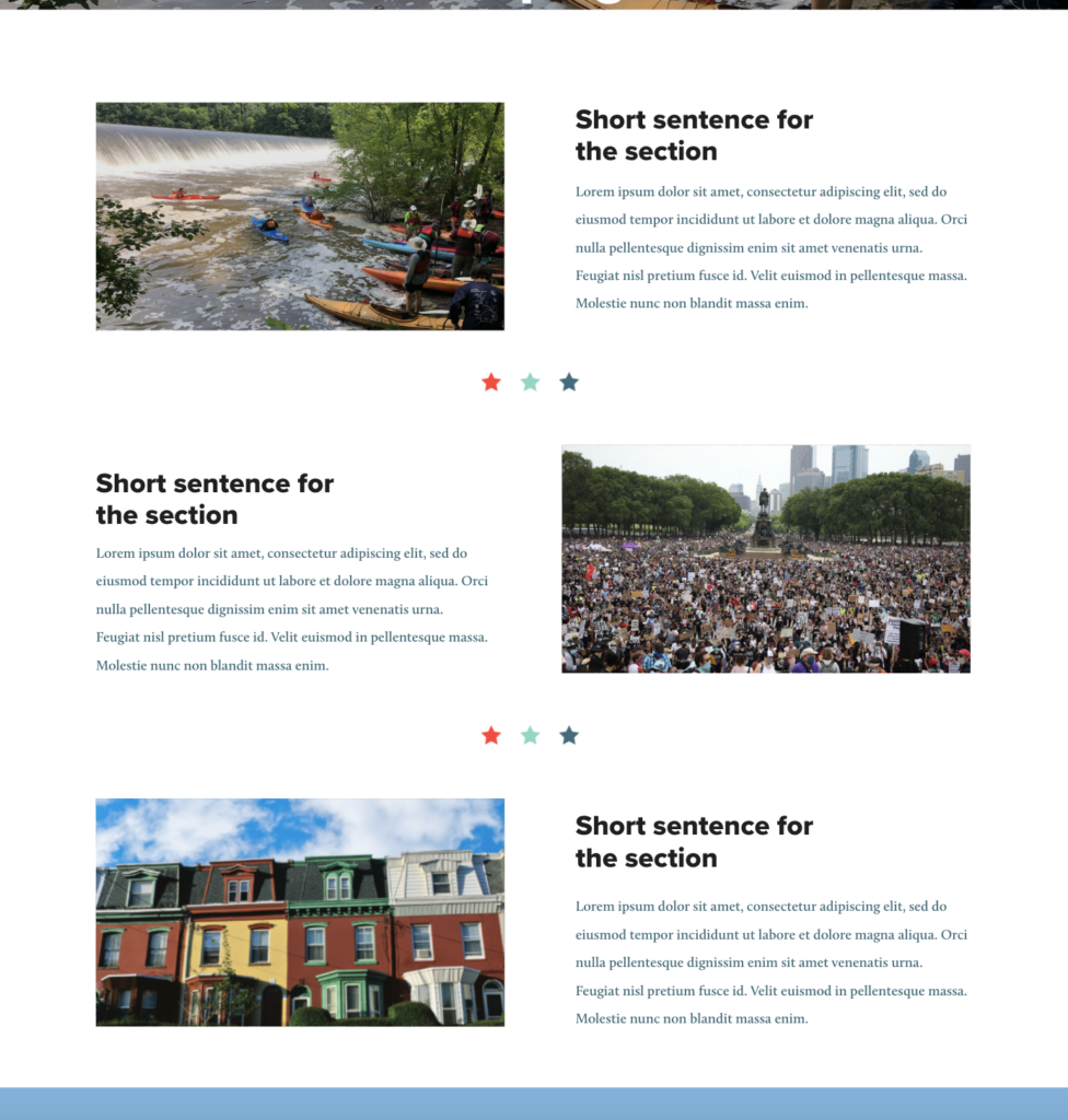
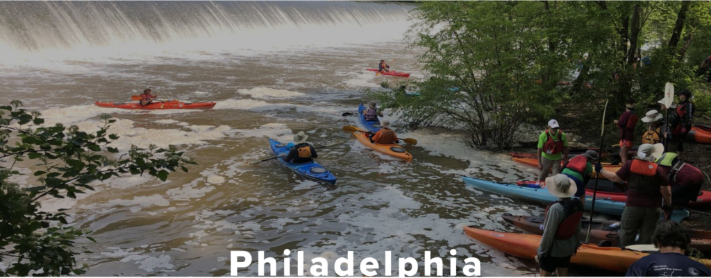
There were 2 specific portions of the Subpage that needed to be tackled. The first was to find a way to design the Subpage so that the user knew that it was different information from the Primary pages. Their formats are similar becuase there are more sections included in the subpages to provide more specific information about the Lenfest Institute’s topics. I still used a small grid system to separate the different sections of information by omitting the big header title that overlapped the images. This allows the user to understand that this information isn’t as tall on the hierarchial level as the Primary Page’s sections.
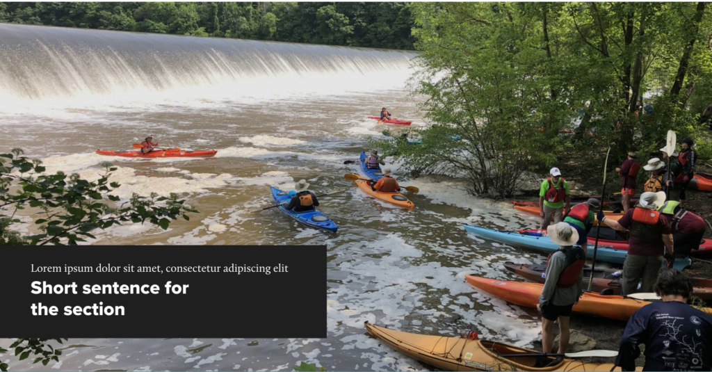
Additionally, the Hero image at the top and it’s title had to also show that the hierarchial level was lower than the hero image and header from the Primary Page. There were 3 different iterations that were developed to show differentiation, but overall, we kept to the simpliest title to allow easiness of understanding the hierarchy in pages.
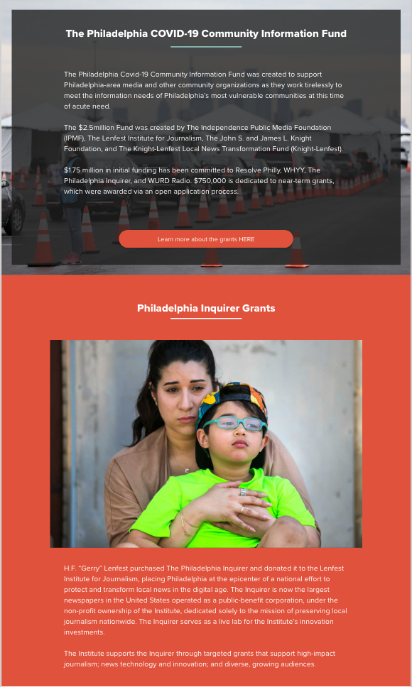
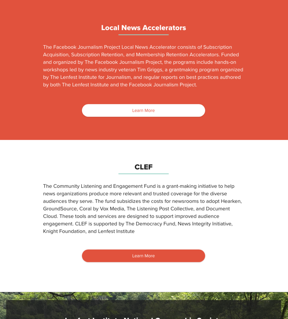
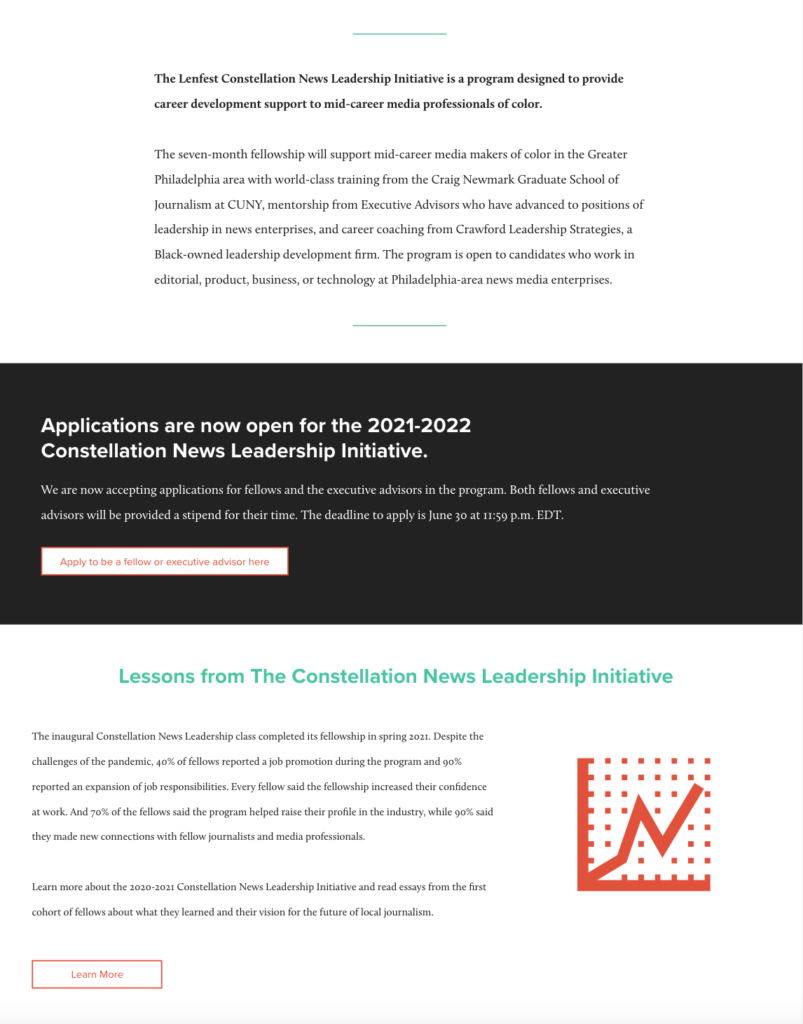
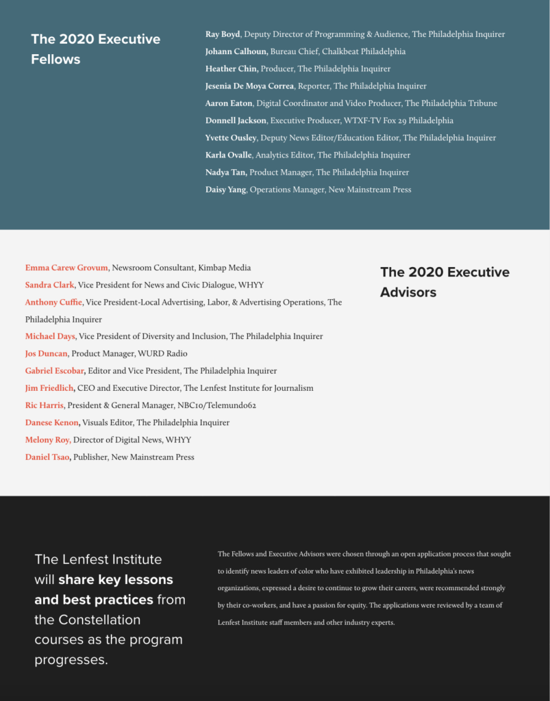
Although I wasn’t able to used the colored sections in the Primary or Secondary Pages, it was later implemented in a way in the Information Pages for the website. When reviewing the information pages, where sections are written in deep descriptions, I found that when reading the text, there were no types of breaks in the reading. It has been seen that when articles seem to long, users will click out of a website in an instant. In order to reduce this lack of user retention when reading, the colored sections were implemented in order to break up the text based on relevance of the information depending on each paragraph. There were several different templates made so based onthe information that is being displayed, it can be adjusted according to the topic, whether it may be listing off donors, or providing some more information on a different topic that can be led to using a button.
In the end, the mockups were fully produced, and the Lenfest Institute for Journalism brought on a developer to officially implent the changes and bring them to life. In 2022, the Lenfest Institute for Journalism changed their website and continues to use the new design changes that were developed, which now allow a better sense of hierarchy, organization, and readibility.